“Eyes Meet Apps: Unveiling How We Navigate Apps”

Whether you’ve noticed it before or not, our eyes don’t move smoothly across the screen when we use applications. Instead, they jump from one point to another. This interesting behavior is known as “saccades.” I’m bringing this up because, as designers, understanding how the human body works can significantly impact the success of our products for users. In this article, I aim to simplify the concept of eye movements, helping us create more effective and user-friendly products.
Think about when you scroll through a social media feed. Your eyes don’t glide seamlessly; they jump quickly from post to post. These jumps are saccades, and they happen involuntarily. This is crucial information for designers because we can leverage this natural behavior to enhance our products.
To illustrate, consider different eye-tracking patterns:
Z Pattern

Imagine you’re scanning a webpage, starting at the top left corner. Your eyes move horizontally, then diagonally down to the opposite corner, and finally across again. This creates a Z-shaped path. This Pattern is typical when users quickly want to assess the content of a page, like on landing pages or posters. For instance, think of a website that sells a product — your eyes might follow a Z pattern as you check out the headline, an image, a subheading, and a call-to-action button.
- Apple’s Product Pages: Apple’s product pages often follow the Z pattern. Your eyes start at the top left corner with the product image and then move diagonally down to the product features and specifications, ending with a call-to-action.
- Landing Pages: Many landing pages use the Z pattern to guide visitors through the main points of interest, such as the headline, benefits, testimonials, and a call-to-action button.
F Pattern

Imagine you’re reading an article. Your eyes tend to start at the top left, move horizontally, and then vertically as you read down. This is the F pattern, and it’s typical for text-heavy content like articles.
On average, users glance at about 7–10 words in the first result’s opening line, around 5–7 words into the next one, and even fewer as they scroll down the results.
- New York Times Article Pages: When you read an article on The New York Times website, you’ll notice that the headline and the first few lines of text are usually positioned at the top left corner, creating an F pattern. As you read down, your eyes follow this horizontal movement and occasional vertical jumps.
- Medium Articles: Medium’s article layout often adheres to the F pattern. The title, subtitle, and initial paragraphs grab your attention at the top, and then you read down the content in a structured manner.
Committed Pattern
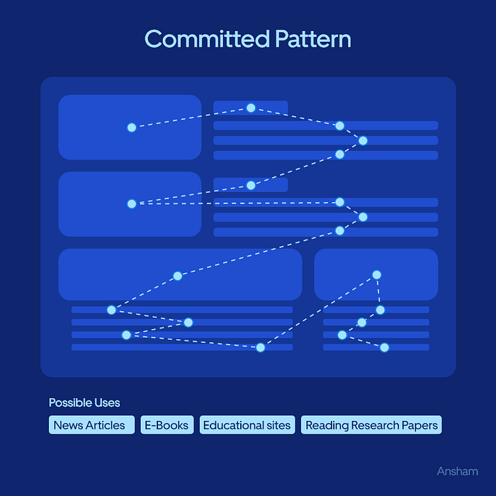
In a task-oriented scenario, such as using a navigation app, your eyes might fixate on a specific route and checkpoints as you follow directions. This committed pattern is about focusing on detailed information to complete a task.
- Google Maps: When using Google Maps for navigation, your eyes may fixate on the specific route and turn-by-turn instructions. This committed Pattern helps you follow the directions effectively and reach your destination.
- Recipe Websites: Recipe websites often use the committed Pattern. As you follow step-by-step instructions to cook a dish, your eyes focus on the current education or ingredient list.
Spotted Pattern
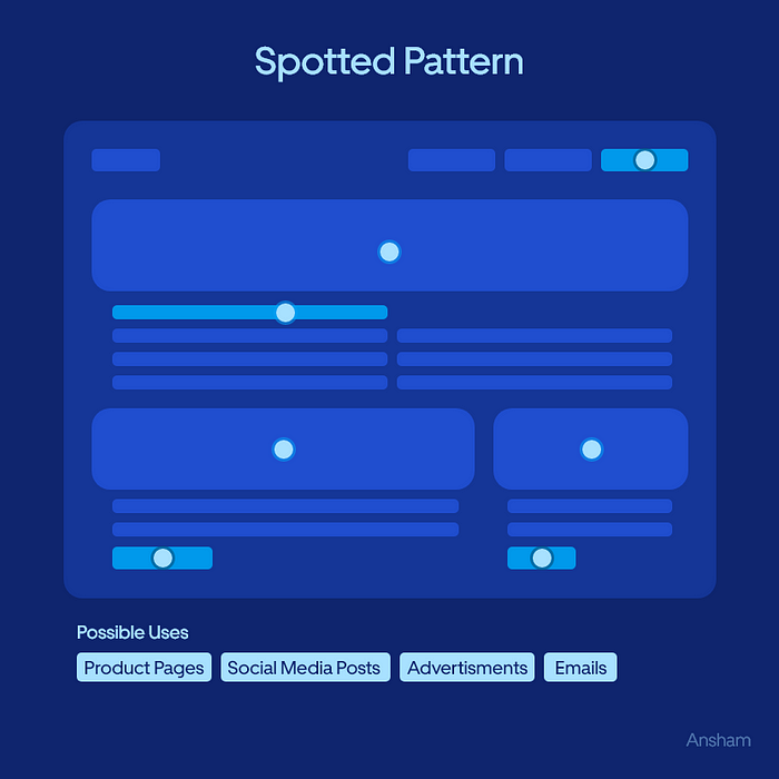
When looking at an image gallery, you might jump to different focal points of interest, like people’s faces and critical details in the image and call-to-action buttons.
- Pinterest: Pinterest is an excellent example of the spotted Pattern. When you browse through pins on the platform, your eyes jump between different images, focusing on the details that interest you the most.
- Online Clothing Stores: Websites that sell clothing often use the spotted Pattern. As you browse various items, your eyes jump from one product image to another, focusing on colors, styles, and details.
Layer-Cake Pattern
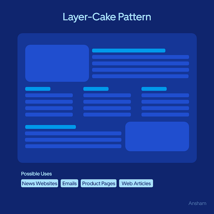
Think about a website with layers of information, like a news site. Your eyes may jump between headlines, images, and captions in a layered manner.
- CNN: News websites like CNN often use the layer-cake pattern. You might notice that headlines, images, and captions are layered, allowing users to choose which content to engage with first.
Bypassing Pattern
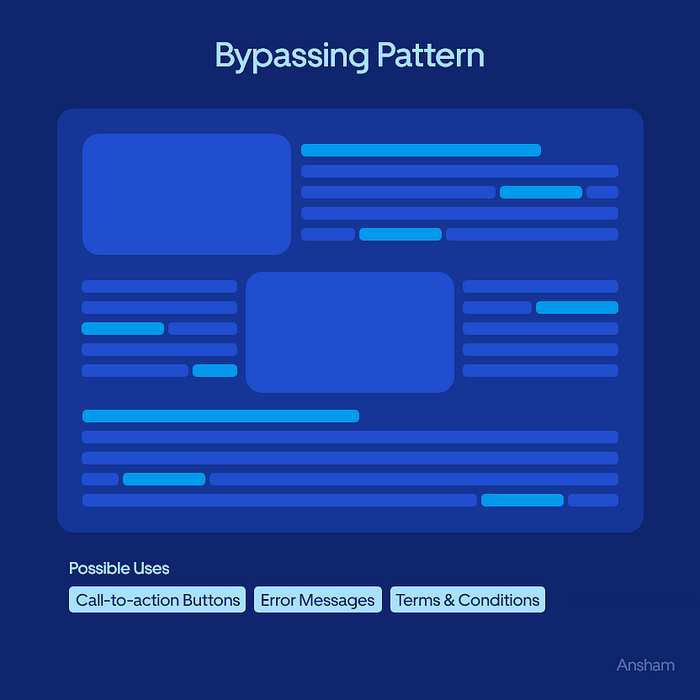
Have you ever skimmed through a long document? In this case, your eyes might jump around and bypass large chunks of text, looking for keywords or headings that catch your attention. This bypassing Pattern is prevalent when users look for specific information without reading every detail. Consider a lengthy Terms of Service document. Users might jump to privacy or user rights sections, bypassing less relevant sections.
- Privacy Policy Pages: Websites’ pages often follow the bypassing Pattern. Users might jump to sections like “Data Collection” or “User Rights,” bypassing the legal jargon to find the necessary information.
- Long Academic Articles: Research articles with extensive sections often encourage readers to use the bypassing Pattern. Readers might skip to the abstract, introduction, and conclusion to get a quick overview of the study’s key points.
By understanding these patterns, we can design interfaces that align with how users naturally interact. For instance, placing important information at the start of an F-pattern or arranging images to support the spotted pattern can make our products more intuitive and engaging.
In conclusion, our eyes don’t glide smoothly over screens; they make rapid jumps. As designers, we should embrace these natural eye movement patterns to create user-friendly and effective products. Whether it’s an article, an image gallery, a layered website, or a task-oriented app, catering to these patterns can enhance the overall user experience.